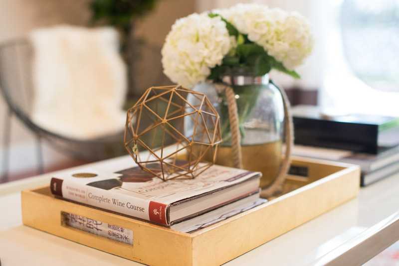
Interior Designer Nicole White Breaks Down Her Vibrant Style
Writer Monique McIntosh | Photography Jennifer Hillstead
South Florida homes couldn’t look more chic than they do in the hands of interior designer Nicole White. Infusing oodles of glamour, the Jamaican native combines sleek, contemporary lines with a fresh take on color, inspired by the Caribbean.
This self-taught designer and former journalist always nurtured a fascination for creating beautiful spaces. “I was that kid always moving around the family furniture every day,” recalls White. She started out planning her enviable interiors as a side gig, growing her clientele base until her hobby could become something more serious.
Today, Nicole White Designs Interiors has attracted much acclaim, with features in Better Homes and Gardens, Ocean Drive, HuffPost and Apartment Therapy. She was also named one of the top 25 interior design firms by the South Florida Luxury Guide in 2016, and dubbed one of the 10 emerging designers to watch by the Black Interior Designers Network. Her popular blog, Live, Laugh, Decorate, also serves up plenty of Instagram-ready inspiration.

“You wouldn’t want to hire me to design an all-beige room,” jokes White, as she delves into her design perspective. “I can do it, but I love layering colors and textures within a contemporary aesthetic.” Though her approach embraces an international modernity, White says her tastes never wandered too far from her Caribbean origins. “I can’t hide color, because I grew up around color. The rich hues of the markets, the open ocean – they have always served as an inspiration.”
But it takes a lot more than deftly matching color swatches to create a successful, lasting design company, as White can attest. “I’ve learned to focus on the business of business, which can be so hard for creatives.” She explains that, “running your own firm is not as glamorous as what you see on HGTV. It takes a lot of hard work, good negotiation with vendors, and strong follow-through with clients, to develop meaningful relationships. And a lot of coffee too.”
The trick, White says, “is to never lose the passion for design, no matter how busy it gets, or how stressful it is. When it’s over, the results are all worth it.”
We Chatted More With the Designer About One of Her Favorite Home Projects, and the Secrets Behind Her Signature Style.
Describe this project’s style in three words.
Global, modern, eclectic.
What was the brief for designing this home?
We were given complete design freedom. This wasn’t an easy process, since our clients live overseas, but we paid close attention to the ideas they shared with us virtually.
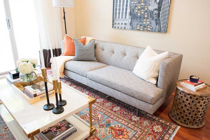
The family’s Afghan rug in the living room is stunning! What’s the story behind it?
This rug sets the tone for this room. The owners literally went to a bazaar in Afghanistan hunting for rugs, sending us photos so we could make selections based on the dimensions we needed. We fell in love with this one and a few others, and they shipped them home for us to incorporate it in the home.
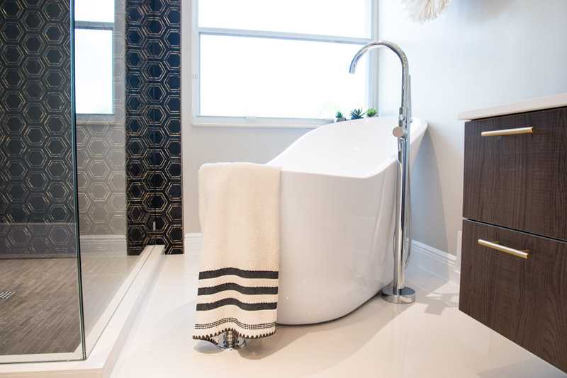
The monotone bathroom is a major departure in this colorful home. What inspired that choice?
We wanted to take their wish for a modern, global and luxurious home to the next level. The black and white, with touches of gold, definitely achieved that, and was a great way to balance the colorful choices we used elsewhere.
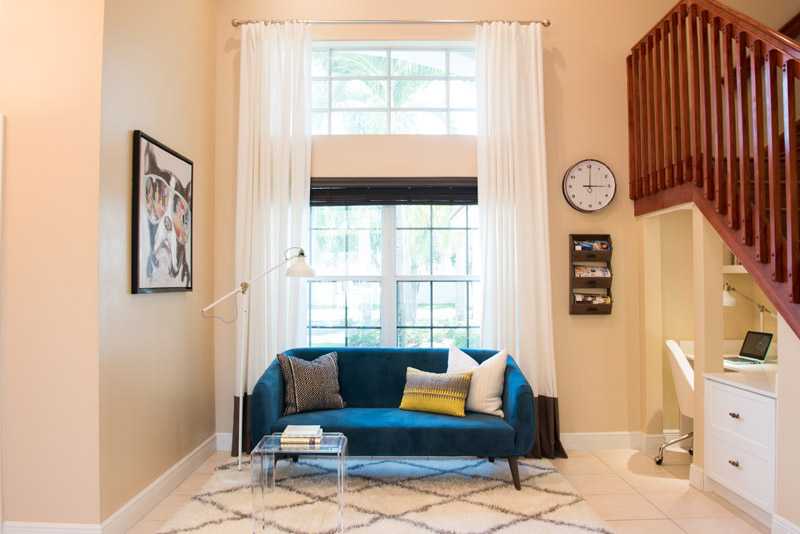
How did you reframe the old dining room as a home office?
We stumbled across the extra space under the stairway as we remodeled the downstairs guest bathroom. It felt like such a waste of room, so we decided to transform it to a home office and lounge, since there was another dining area by the kitchen. It’s definitely a custom feature that highlights the many ways you can find hidden square footage in your own home and make it as beautiful and functional as possible.
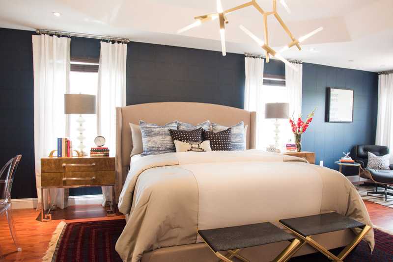
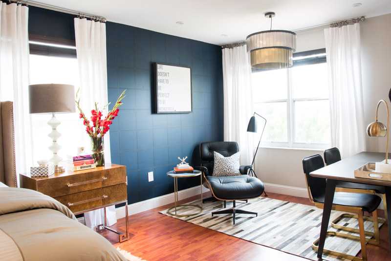
Bedrooms with dark walls are so in vogue now… but can be intimidating. How did you make this one so cozy?
We’re doing a lot of navy and black walls in design these days, but we always reached for layers of texture. This moody, faux leather wallpaper from Wall Republic was the way to do that here. We balanced it by only doing an accent wall, and cooling things down with light walls, a linen headboard, and neutral bedding.


